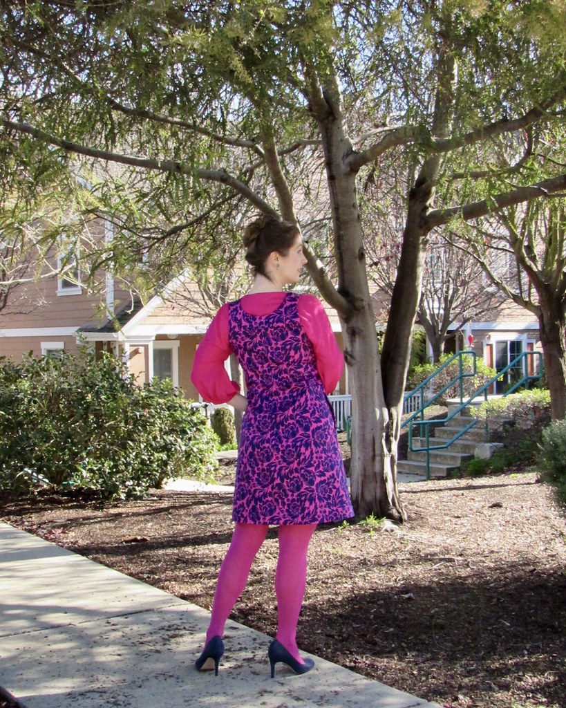
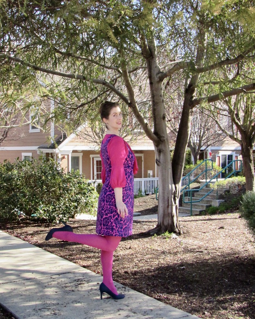
There is very little danger of blending into the background in this outfit!
I do love jewel tones, and bright pink is definitely one of my favorites.
Years ago, I was a bit dye obsessed, and these are two of the items that came of that preoccupation.
The blouse came first. I decided that I needed a bright pink blouse in my life, and so I made one with a little help from Dharma Trading Co. fiber reactive dye and white rayon twill. Soon after, I had the opportunity to help test The Ivy Pinafore for Jennifer Lauren Handmade. I first made the tented silhouette version, and next, this more fitted option. I had a graphic blue and white print on hand, and the pink blouse came to mind, so I went ahead and dyed the print as well to match, thinking that the two garments would pair nicely.
I did love the original blue and white, so when I stumbled on more of the print at JoAnns, I purchase more, and eventually made this Donna Karan design. The design (Vogue 1220) looks amazing on everyone. It's now out of print, but if you ever gets your hands on it, make sure to scoop it up!
But I am glad that I decided to try a dye experiment with this print. It may have taken me years to finally wear the outfit, but I love how obnoxious the bright colors are.
It is also one of the outfits that has reintroduced me to my tights collection. The pink stands out in a sea of more neutral tones, so they mock me every time I open the drawer. But finally, I have the last laugh as they are an almost perfect match to the bright pink dye.
And it feels wonderful to have finished another project that was set aside for so many years. Which reminds me, I really need to get back to all the other half completed garments I have tucked away.


Precioso y el colorido🤩🤩
ReplyDeleteBESICOS.