New Spring Vogue Patterns were released last week, and there are no new Vintage Vogue patterns to tempt me; disappointing, but really, I have stacks of them waiting to be used, so I shouldn't complain.
Vogue 9355 was the teaser that was shown on the McCall Patterns instagram account for the week prior to the release. I do like this, although, on the model, the off-the-shoulder treatment for view A and B is not very flattering on the arm. It also looks rather restrictive. I see that there is a sleeved version included, although they look a bit dowdy when compared to the rest of the design. The look is classic and I am tempted, but I believe I will wait for some real life versions to appear before purchasing this.
The other design that caught my eye is Vogue 9357. I adore the oversized pockets and the bodice detailing. I think this design has a whole lot of potential!
The made up version this jacket had me skipping right past, but upon closer inspection (always make sure to look at the technical drawings!!) those lantern sleeves are fabulous. This is actually quite a nice 1950s swing jacket silhouette with welt pockets, a wonderful collar, and those sleeves!! Did I mention I love those sleeves?!
So, nothing I am dying to start sewing immediately, but there are a few goodies to be found. Do you have any few favorites?
Thursday, January 31, 2019
New Vogue Patterns for Spring 2019
Tuesday, January 29, 2019
The 2019 SAG Awards Red Carpet
Another week, another red carpet. This time we have the annual SAG Awards. After the Golden Globes, I was hoping for another rainbow of gowns to appear on the red carpet. However, for this year's SAG Awards, there is a lot of black, white, red, silver, and gold. I am hoping the Oscars will have a larger range of color.
And for all of that complaining about a lack of color, one of my favorite looks of the evening is Amy Adams in solid black Celine. Hey, there is no logic to be found in fashion likes and dislikes, right?! What I like most about this dress is all of that texture, from the pleated and gathered bust and peplum, to the wide beaded waist. Texture is about the only thing that draws me to solids in the fabric store, and the sculpted quality of this plain black fabric really works. I love the shoe choice with the dress (I know Amy Adams has dance in her background, but I never noticed her feet - those bunions make me suspect she has a ballet background). And I really appreciate the tasteful slit. Ladies take note: you can leave something to the imagination and still look sexy. The eye makeup is gorgeous, although here begins another diatribe on the lack of lipstick in the world of the leading lady. Where has all the red lipstick gone?!?
Here is a Monique Lhuillier gown that I actually like, miracle of miracles. Sophia Bush looks like a classic leading lady with that wonderful full length cape (minus the lipstick). Although I suspect that I would not like the raw edge of the hemline up close, and the necklace underneath the cape is a bit much. But the hair is perfect!
Here we have a slightly more colored lip on Susan Sullivan, although I would have liked something with a deeper tone. But the dress is exquisite! I love off the shoulders paired with long sleeves! And that diagonal hip seamline is fabulous. If I had to nitpick, I wish the individual pearls were slightly smaller, and that knot was less in the middle of the length of pearls and more like a third from the bottom. And now I think I see dark hose with a peep toe - not thrilled with that, but I am going to overlook it because the rest is so very good! And the hair is gorgeous - if you are going to wear it down, it shouldn't look like you just rolled out of bed, for goodness sake.
Okay, I am going to start taking a collection for lipstick, because it seems that none of these woman can afford a tube of lipstick, which is a darn shame. I really like this look, although the stiletto earrings get lost with all that bling on the neckline; I would have like to see something more substantial in the way of earrings. The off the shoulder look is beautiful, but I don't like when the edge droops down, cutting the upper arm off at its widest point - it's not as flattering as it could have been if the line was straightened out. I would also like to personally thank Mandy for not thrusting her leg out of that slit for the photo op.
This Rosario gown on Stephanie Shepherd reminds me of the flat bodiced look of the late 1990s that I love. I wish the straps sat further out on her shoulders, and I wish the skirt was a little more full, but I really like the overall tone of this. And the lipstick . . . blah, blah, blah.
Yikes! Alison Brie went a little crazy with the Miu Miu. What the heck is this thing? Is she supposed to be some kind of winged demon, or is she still hoping to get invited to model at the Victorias Secret Fashion Show - does everyone remember that bedazzled bra from the Golden Globes? Are those wings or an oversized bow to match the little ones just above the waist (exactly where we want to add width to the silhouette, right?) It's not her fault, but silk satin sheath dresses always crease after being seated, and I think it looks sloppy in a photo op like this. Not sure what the solution is, but I seem to recall some star having to lay down in the limo to avoid wrinkles. And if I am being honest, when the dress is amazing, I can look past the wear wrinkles; but this thing is such a mess, so it just adds to the overall nightmare. Oh, and no lipstick . . . what a surprise. Was a memo sent out, or something?!
Now, if Caroline Aaron was going to the Country Music Awards, I might pass right by this . . . interesting choice. As it stands, there is just way too much going on here. Bell bottomed sleeves, bell bottomed trousers, no feet to be seen, crazy hair - it's all too much for me. But she didn't get the no lipstick memo, so thank goodness for small favors!
Now Lily Tomlin knows how to work a sequined jacket! Unfortunately, I am still horribly distracted by what Jane Fonda has done to her face. But look, she is actually wearing lipstick! Maybe she though it would distract from all the bad fillers? I am not really sure what I think of the Valentino dress. The sleeve length looks slightly short, but that could be due to the position of the arm. I do love the soft blond curls. But why did she do that to her face? It makes me sad.
Ooooh! Now here is how to do a formal sleeved gown! Love that plunging neckline and the strong shoulder on those sleeves. It even looks like she might be wearing some color on her lips. And I love that she is wearing her hair up. My only issue is the diamonds. It looks like there are some rubies in there as well, but I find the light jewelry to be slightly distracting from that amazing dress. It even looks like they got the horsehair braid right on this one. Really, really stunning!
I am always excited to see what Sandra Oh is wearing to these events. The lady has style, and Jenny Packham was an excellent choice. Pairing the liquid silk with the encrusted beading is exquisite, but I am not sure about that bodice drape on the left side of the picture. It doesn't look like the shoulder is tied, so that should have been fitted better. Maybe it needs to fall further off of her shoulder so it doesn't buckle at center front? It's distracting, but I am going to hope it's just the way she is standing that pushed something out of place. Love the dramatic earrings paired with a single ring. The hair, on the other hand, is . . . interesting. Maybe it looks better from a different angle, but those bangs look sloppy.
I want to love this dress, but I just can't get there. First off, why was no one around to straighten Rumor Willis' necklace? And then the hem is slightly long, but those sleeves are not long enough, which is beginning to be a trend. Blousey sleeves should blouse! This may actually be a working wrap dress, which explains the strange neckline issues. It could have been fantastic, but the fitting issues and the off kilter neckline and necklace ruin this one.
What I am most curious about Emily Osment's dress is the fabric. Is this scuba? I am going to have to research Rachel Gilbert to find out. There is something strange about the outline of a bra just under the neckline. Is that supposed to show? I suspect the answer is no. And the waistline seam looks a bit bulky - anyone have a clapper handy? But I do love the pleated skirt and the referenced pleats in the ruffle. I really, really like this look. But what is is made of? Anyone know? I also like the lipstick!! I was so distracted by the frock I almost missed it! [Okay, it breaks my heart a little, but I believe this is made out of polyester because here is another dress that looks like it might be made out of the same fabric. Still love the look of the dress, just might not want to wear it.]
Aside from the extremely unfortunate placement of those woven dots on the bust area of this Zac Posen gown, I think this is a wonderful look for Laverne Cox. The hair is lovely; if you are going to have pieces of hair pulled out of your up-do, they should be curled! I don't love the chain traveling from shoulder to shoulder which looks overdone; I would have rather had a bracelet or ring. And some bright red lipstick would look amazing with this . . . hint, hint. But this is pretty close to perfect. So glad that capes and capelets keep returning to the red carpet!
I want to like the dress that Gayle Rankin chose, and I really appreciate that bold lip. But the eye makeup makes her look like she has two black eyes, and when are women going to stop dyeing their hair the same shade as their skin? It looks odd. That rocking horse clutch is a very whimsical addition which I like paired with the slightly off kilter bow treatment embroidered or beaded on the dress. It think the bodice is very flattering on her. But I think the ensemble is missing something. I would love to see what Helena Bonham Carter would do with this, for instance. I don't think that Gayle totally committed to the styling and so something feels off.
Okay, things are taking a turn for the worse. Madeline Brewer is wearing something that looks like it cost about $20 from someplace like H&M. I love the sleeves, just not really on a formal gown, and definitely not made of scratchy looking lace. And then the skirt is completely sheer? Really?!? Not good.
This column dress on Marin Hinkle is a breath of fresh air after that lace mess. Simple, and elegant. The hair and makeup compliment the look. I am not in love with the purple clutch, and if I had to find something to pick on about the dress, I would have liked the tie ends to be cut diagonally instead of on the cross grain for a less heavy feeling. But she looks amazing!
Laura Harrier chose Loewe. I am not familiar with the designer, but I love the choice of color. But the attaching off the the shoulder sleeve by a tiny tab of fabric that became popular a few years ago really needs to go away. Maybe it works on a casual top or a sundress, but this just look silly. The bust is also doing something bizarre. The underwire almost looks sewn directly into the dress, but it doesn't fit her body at all, if that is the case. And the skirt looks like a big old sloppy mess. Is it suppose to be wrinkled? And some sort of seamline seems to be visible around knee height. Is that an underskirt? Whatever it is, I don't believe it should be visible. And the hemming looks terrible - maybe a five inch deep hem would have helped, although I am not sure this could be saved.
Laurie Holden is wearing another wonderful shade of pink, but this dress is also messy. The one arm has a drape attempting to be a sleeve at the same time. Why would that piece come all the way down to the underarm? And the folds and draping at the bustling are horrible. She may have pulled that side down too far, but even so, what is happening with all those bulky folds? The makeup isn't helping, either. This is one of those universally flattering pinks and yet she looks washed out.
I am not exactly sure what to think about Emily Blunt in Michael Kors Collection. I like the color on her (including the lipstick shade!), but I am not in love with this dress. This looks like a great Star Wars gown to me, perfect for one of those party scenes with all of the crazy alien creatures dressed to the nines, but I just don't love it on Emily. It looks to me like a satiny snake is wrapped around her, while the scaley texture of the reptile is limited to the body of the dress. The train also seems too small. She looks striking, as always, but the dress confuses me. If anyone can pull something like this off, it's her, but I just don't like it.
So the question is, if Emily was wearing what Kate Nash is wearing here, would I feel conflicted? I don't think so. This thing looks like someone drew all over it with puffy paint. From the bemused expression on her face, I think she is having a laugh, but is it at her expense or ours? And the visible cell phone in the clear ball bag? It has to be a joke, right?
I follow Oscar de la Renta on Instagram, so I saw some of the details of this dress before I saw the entire look on Gemma Chan. The raw edges of the pleated skirt were already looking rather frayed, so I cannot imagine what a wreck this was by the end of the red carpet. I love the texture that the pleated fans have, but I just can't get over all this frayed edges. I also think that her long torso paired with the short front skirt and trailing back is not the most flattering look. I do love the black waistband and shoes with her dark hair, though.
Anything that has a skirt made of feathers reminds me of Ginger Rogers in Top Hat, including this Elie Saab Couture on Michelle Yeoh. I think the dropped waist looks fabulous on Michelle, but I am not in love with the deep armholes on the bodice. I think the embroidered bodice is competing with the feathers and much prefer the smooth satin of Ginger's gown, but then, comparing the two really isn't fair, because Ginger is always going to be my favorite.
Rachel Bresnahan is wearing Dior Haute Couture, and I am mystified why this strange bust treatment is still around. Maria Grazia Chiuri is an amazing designer, and I generally love Dior designs, but this underwire above the bottom of the bust is so unflattering. If that portion of the dress fit properly, I think I would love this. The lace is exquisite, and I think the muted color works nicely with her skin tone. I love the earrings, but I wish the straps on those heels were a bit more delicate. The eye makeup is a bit much, but it works with the hair, and the contrast to the dress is unexpected but really fun. To bad about the fit through the bust . . .
Why are designers making sleeves too short? I assume that these are meant to be lovely full bishop sleeves, but when you can't see the cuff, they just look wrong. Other than that issues, I really like the silver sparkle on Melissa McCarthy. But a little more color on the lips would be great. And the dark nail polish is a bit jarring with this ensemble.
Oh, Chanel, I just can't figure you out. It's difficult to make Margot Robbie look bad in anything, so the design house has that going for them. They also make incredible wearable works of art that take hundreds of hours and many, many hands to complete, but I never really love the finished looks. What I do like is that this reminds me of dresses on Egyptian carvings. But the embellishment does not seem to be placed in flattering positions on the body, and the swath of white fabric that falls to the floor does not seem finished. The makeup and those earrings work great, but the clutch is too bright to match this look. And so I continue to be confused about the mystique surrounding Chanel.
Patricia Clarkson is wearing Zuhair Murad. And while there are parts of this that I love, the whole thing doesn't mesh as well as I would hope. First off, the hair matching the color of the gown and the pale skin kind of works, but she is in danger of being completely washed out. I do think the pairing of the embroidered sleeves and bodice with the delicate chiffon is truly lovely. The motifs that extend from the hip to the upper thigh really works. I don't love the length of the embroidery on the sleeve, though. I wish the leaves also thinned out as they worked their way down the arm. The lower arm drapes are a great idea, but the execution here is not perfect. The fabric also seems heavier on the sleeve drapes than the overlay of the skirt which doesn't seem like the right choice.
I had to include this one because it looks like someone who just learned to sew was thrown on Project Runway and this is what they came up with. The seams and hemline are atrocious. I couldn't say what Kimmy Gatgewood was thinking when she put this thing on, and I can't find the name of the designer to blame. This is just, well, embarrassing.
Here is a champagne colored frock that I love on Sofia Hublitz. It's funny how the skin toned dresses look great on some ladies and make other look terrible. I think the lipstick helps, although why would you choose an orangey red when the belt on your dress is a deep rich blue red, heaven knows. I love how the beading drips right over the slim bit of red velvet. Hate the hair, and I think the bracelets are too much, but I do love that delicate beading.
I am getting really, really tired of the thigh slit. It's one thing to have a dress which allows for more range of motion, but to pose specifically thrusting the entire leg out is just tacky. The dark makeup is definitely at odds with the white Dior Haute Couture dress which may have worked nicely in some cases, but I am just too distracted by those horrible shoes. And the jewelry is all over the place. The silhouette looks more like a retro bathing suit with a towel wrapped around the waist than a formal gown. I also have a very hard time with the fringed edges because I think it looks sloppy in so many cases, including this one. Maybe it works up close? The color is also not helping the situation. I am reminded of bedsheets. Expensive bedsheets, but still toga party appropriate. I actually love quite a few of the pieces in the new Dior Couture collection, but in this venue, with this styling, I don't think it works.
Here is a much more appropriate use of the color cream! Glenn Close looks spectacular in Ralph Lauren. I would have liked some lip color, and maybe a different necklace (something with a more v-shape to compliment the neckline of the jacket), but from the hips up, this is spectacular. And then the pants go and muck it up. The fit is a little too baggy for my taste, and WHERE ARE HER FEET?! This just looks silly, and I wish the trend would die. I want to see a little bit of shoe, please. Yes, the floor length makes you look a little taller, but you look ridiculous because feet are supposed to show when you wear pants!
And now for some color! I actually hate this bright yellow color, probably because it makes me look like death, and I am jealous of women who can rock it. Susan Kelechi Watson is one of those women. The hair is great, and I think the jewelry works with the dress. The overall silhouette is very flattering on her, but the space between those tiered ruffles is not sitting well with me. It looks like they ran out of material and had to work with limited resources. The proportions of the ruffles are great - they just need a few extra inches to cover the join of the next one. I am also going to have to find a picture of the back of this one because is looks like it might be pretty exposed and I am hoping they criss cross!
And I though we were going to make it through the evening without a horsehair incident. I was wrong. I can't find the designer of Jenna Lyng Adams' dress, but look, they even cheaped out and used the narrow stuff instead of the five or six inch braid. The fit is pretty good, and I am fairly certain that this thing is not going anywhere, but for some reason I feel like that bodice is going to expose something any second now. I also wonder how comfortable it is to sit in a skintight dress with a row of tiny buttons all the way down my bottom. I would guess that it is horrible. Oh, the things we do for fashion!
My first through when I saw this Zac Posen gown on Julia Garner was, "where can I get me some of that fabric!!" I like the overall silhouette, but I wish the neckline sat an inch or so lower to elongate her neck. The other thing that bothers me is the pointy toed pumps I have spied under that hemline. At least they are not super visible. But the fabric!! It's yummy! And no horsehair in sight!
Here is proof that draping is challenging. I love watching pros go at it with a length of fabric and a dress form - it's an amazing gift. However, there is an art to it, and this dress is certainly lacking in artfulness. This looks like student work, and the draping is clumsy and sloppy. I feel like there is a lot of similarity in millinery or even art forms like dance. It's supposed to look easy and effortless, but making it look that way takes a lot of hard work. I do love the color that Cara Santana picked, though! But don't get me started on the hair. She looks like she just got out of the swimming pool and pulled it up into a sloppy bun; not suitable for a formal affair, if you ask me. This dress should never have made it out of the atelier, and I suspect the designer know it because I cannot find a mention of who they are anywhere.
For Catherine Zeta Jones, I will start at the top and work my way down. The hair looks stringy, and the makeup is lackluster. But if anyone can work that plunge neckline by Zuhair Murad Couture, it's Catherine. There is something slightly off with the opaque shoulder pad situation where the sheer sleeve is attached. I am not sure how to resolve this . . . maybe more of an angle at the join of sheer and opaque? And I am going to give her a pass on that slit. It's bordering on too high, but the draped train makes it look intentional instead of overdone for me. The shoes are far too insubstantial and a little too strappy for the dress, though. I do love her in this dress, but I think it would have been even more amazing if that navy color was a bit of a brighter blue with her dark hair. But overall, a really good choice!
So many dresses, so little time! Did you have any favorites this time around?
[Click on image for source]
Tuesday, January 22, 2019
Finding a use for all of that leftover tulle . . .
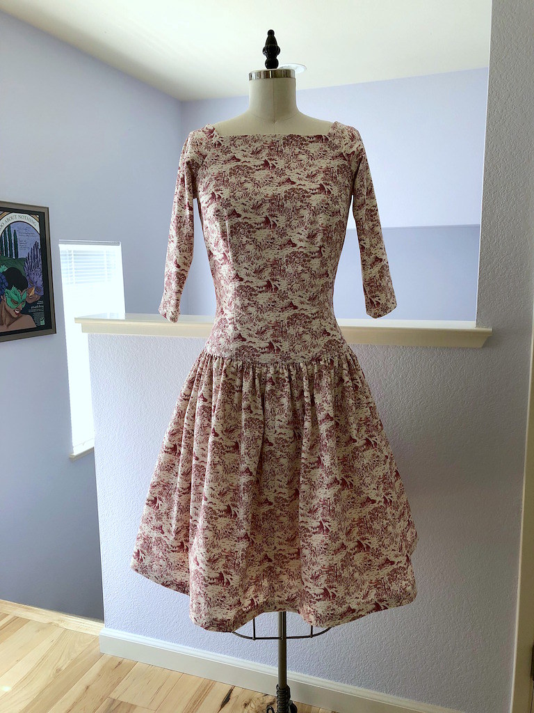
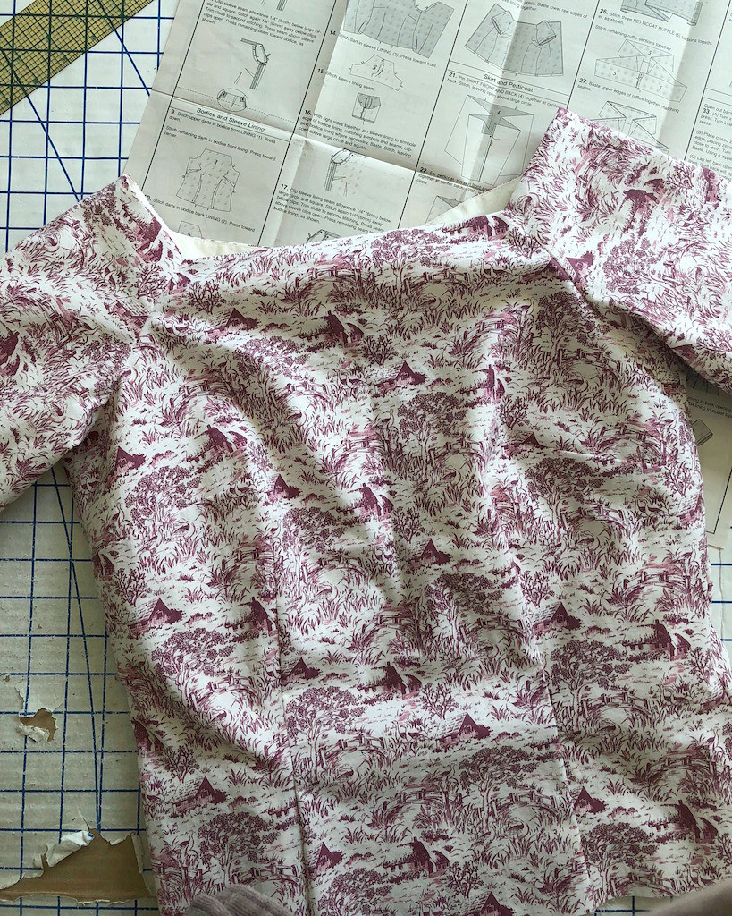
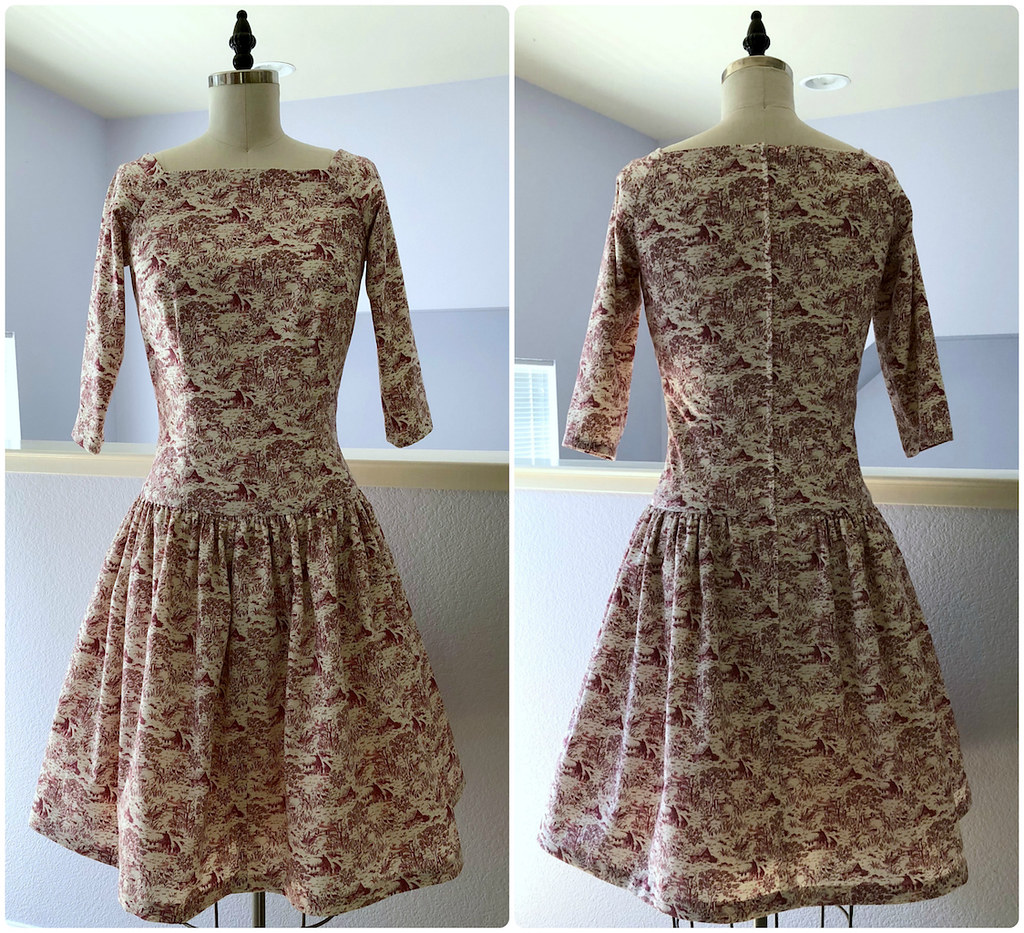
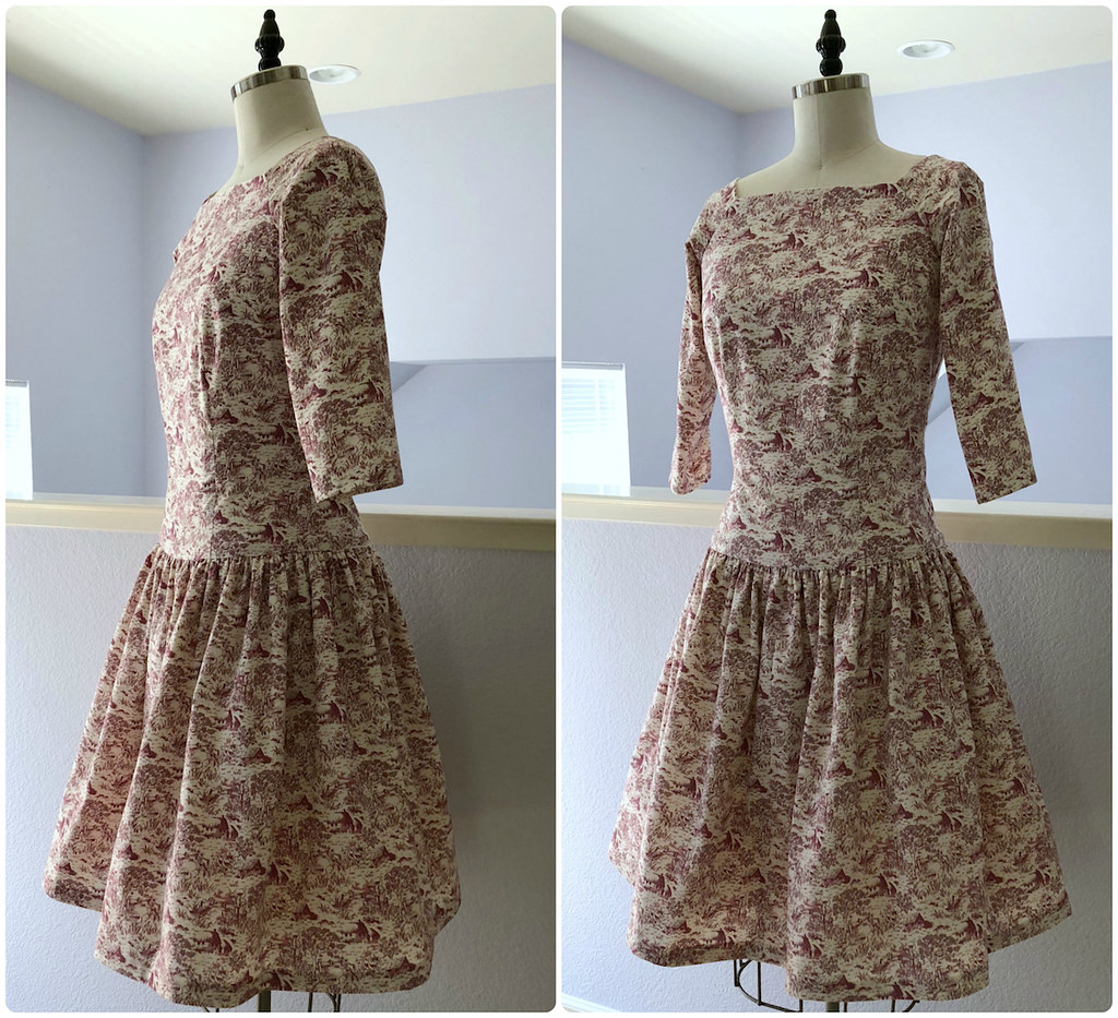
I have been holding onto this toile de jouy cotton print for years. I chose it because I loved the print, and never really thought about what I would do with it. A few years ago, I decided it would make an adorable set of pajamas, but dress patterns kept distracting me, and the pajamas got pushed to the back burner.
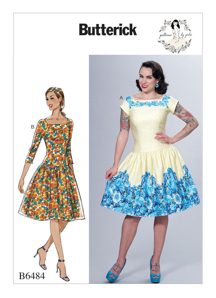
But last Fall, I came across the yardage while hunting for some other fabric and decided that it would pair nicely with Butterick 6484. The pattern is made for border prints, so my 45" wide horizontal print needed a layout modification and an extra seam in the skirt center front, but I was determined to make it work.
The pattern also calls for a ruffle to be added to the skirt lining for an extra bit of poof, and I have made a couple of vintage reproductions with an attached petticoat. Theoretically, this is an awesome idea.
In reality, they end up taking a whole lot of space in the closet (no surprise, there!) and they are a lot more challenging to wash with all that extra bulk. These days I prefer to keep my full petticoats separate from my dresses!
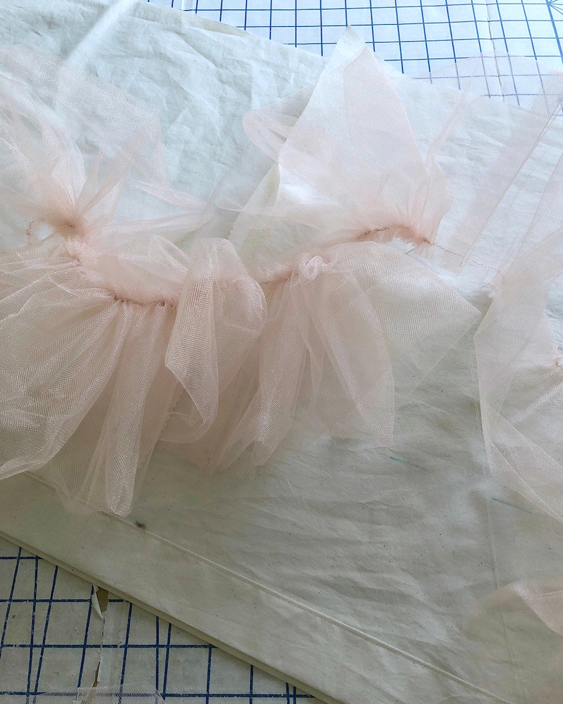
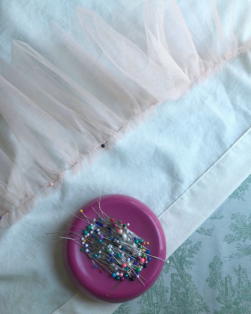
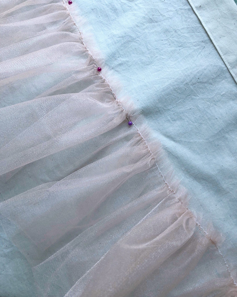
So my first thought was to forget the added ruffle. However, I had a bunch of leftover tulle from some past project that was taking up space in the sewing room, so I decided to add it to the dress since this is on a much smaller scale. I like to stitch my petticoat ruffles upside-down first, then flip them over and finally topstitch through the seam allowances. This keeps the lightweight tulle from flipping up. A little more in depth info about that process may be found here.
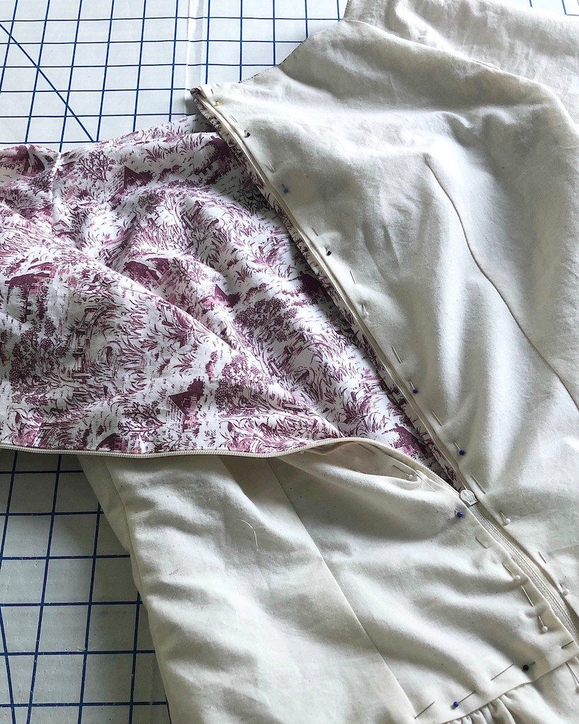
I lined the bodice with muslin I had on hand, which means the entire dress was made from stashed items! I love it when that happens!
I had a bit of a fitting issue with the shoulders. The sleeve is shaped with a very small dart at the shoulder. As drafted, this makes the dress stand out from my body at the top of my shoulder. I added lingerie guards which keeps the sleeve from sticking out, but if I make this again, I think I will mess around with the size and length of the dart and see if I can fix the issue.
But overall, I am so glad I rediscovered this fabric and the dress pattern!
Wednesday, January 9, 2019
A Very Warm Wool Coat
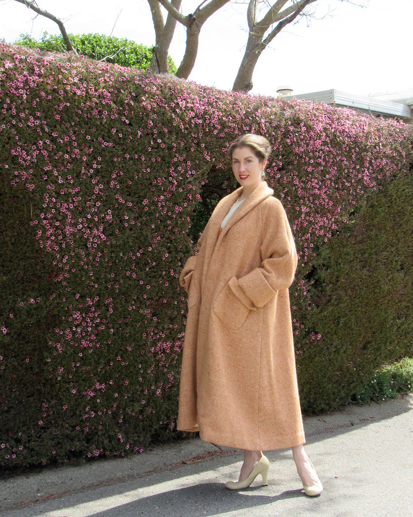
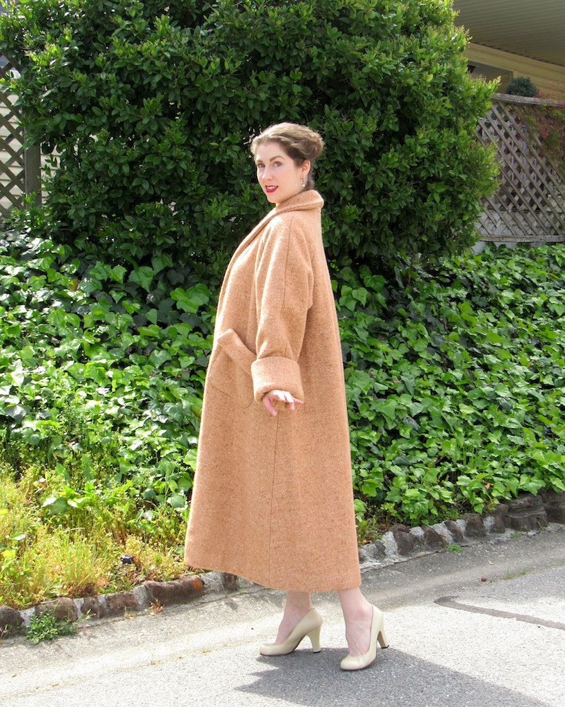
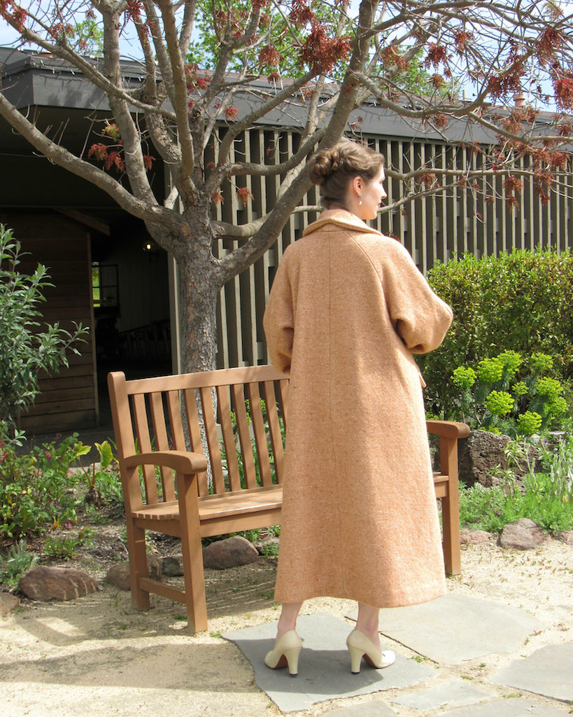
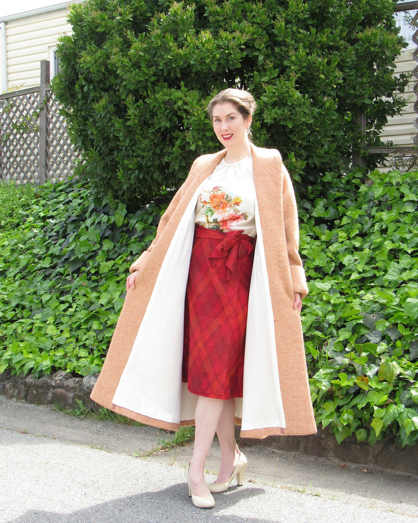
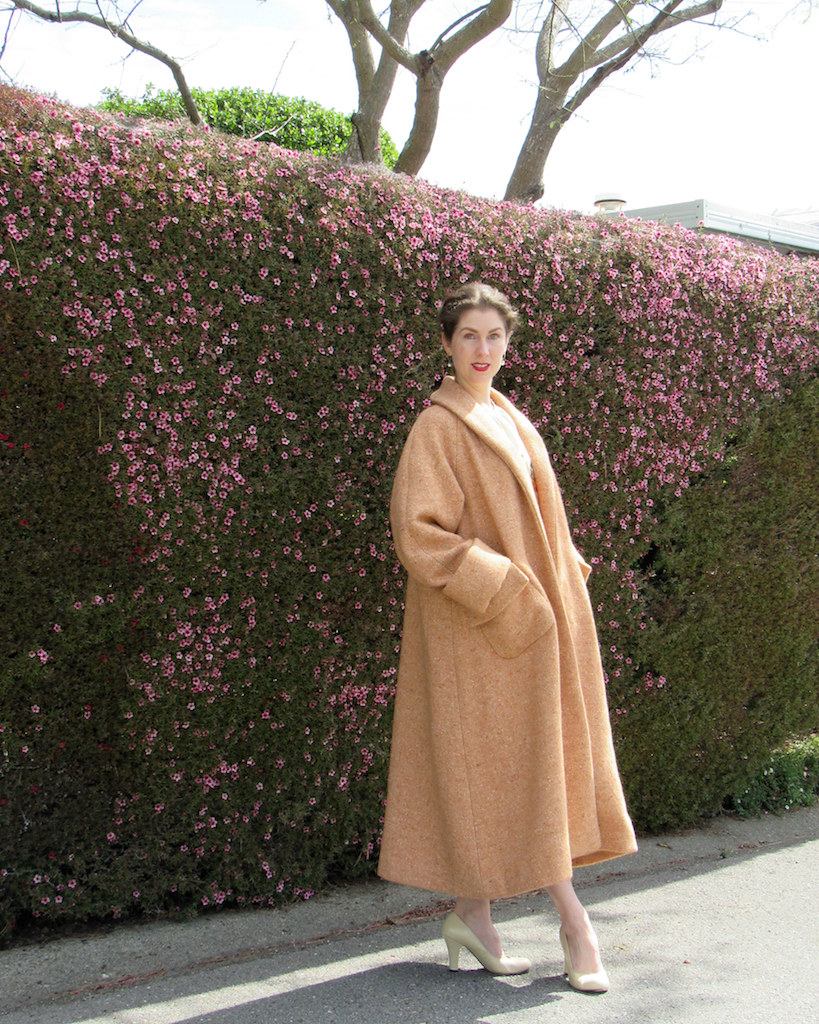
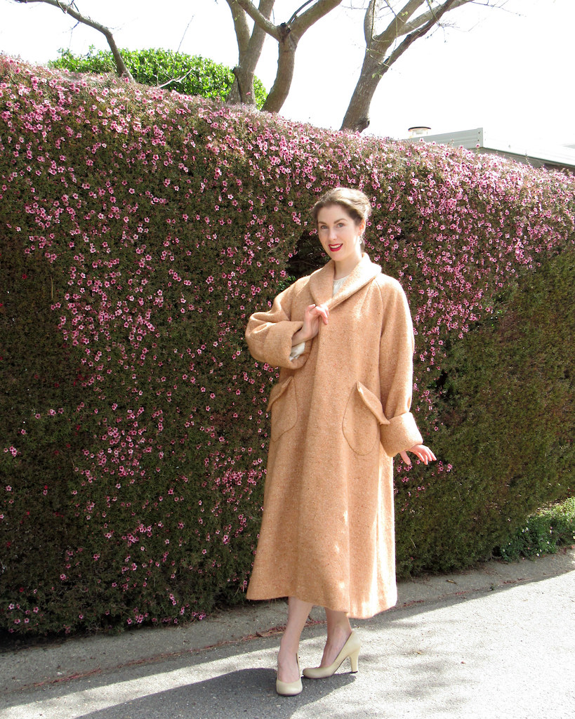
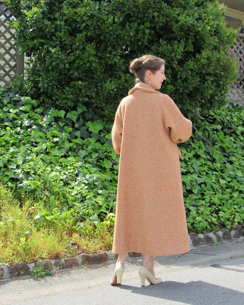
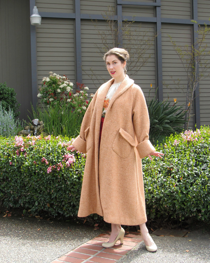
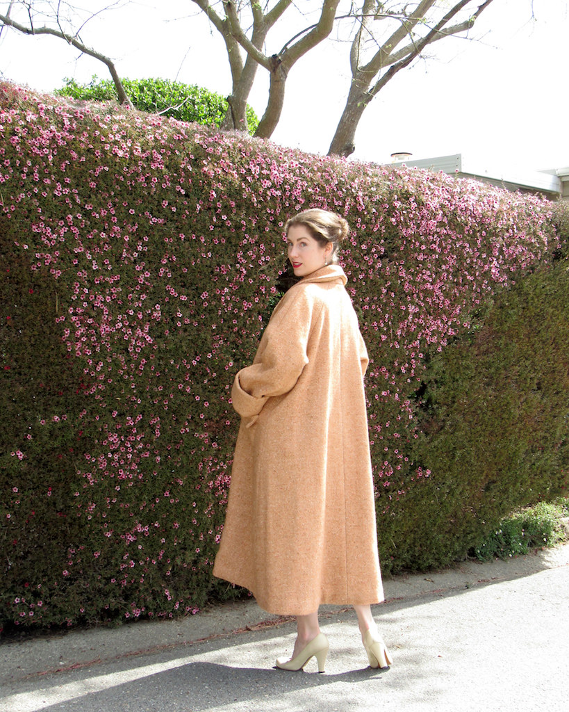
In an effort to keep my resolution of posting more of my finished projects on the blog, here is Simplicity 8509. This is actually the second version of this design that I have made.
The first was a bit of an experiment, and when it came out even better than I expected, I jumped right into this wool version. And adding another swing coat to the collection could never be a bad thing!
I shared quite a bit of my construction work on this garment from wresting with the heavy fabric, to the lining, making the most of sewing tools, to adding some patch pockets, and finally, the finishing touches.
The extra work and time was definitely worth it.
And while I finished the sewing on this coat last winter, it has taken me this long to post finished photos.
I am currently working with wool in the sewing room, in the beginning stages of making another wool coat (this time with a 1940s flair).
I am going to do my best to finish this one before the weather turns.
They definitely take some time, but finishing a lined coat is so fulfilling. And getting the bulky wool out of sewing room bureau and into the coat closet creates lots of room for more new fabric treasures. (Although that can be a rather dangerous situation!)
Coat: Made by me, Simplicity 8509
Blouse: Made by me, Simplicity 1692
Skirt: Banana Republic
Shoes: ReMix “Babydoll”
Labels:
1950s,
Finished Projects,
Sewing,
Simplicity 8509,
Vintage Reproductions
Subscribe to:
Posts (Atom)


