Pages

Monday, February 27, 2017

The 2017 Oscars Red Carpet

It's that time again . . . time to gaze longingly at couture gowns I wish I could examine inside and out, and at the same time pick apart the mess that sometimes manages to make it down the red carpet.  This year, I can't even say that I have a favorite.

But I will say that Viola Davis looks AMAZING in Armani.  Just don't make me watch her trying to walk in the heels that I assume are hiding under that dress, it will ruin the illusion.  If I am being picky, I am not in love with that clutch with the bracelet.  But really, this is a fabulous look for her, and she should definitely be adding more of that red color to her wardrobe.  Just don't tromp about like a football player when you look this stunning, please!


Kirsten Dunst chose Dior Haute Couture, and the arched neckline is lovely.  I also really like the slight high-low hemline that shows off the shoes (which I really, really love).  I would have preferred to see this in a color, though.  She wore a lemony colored dress with short sleeves and collar in Cannes earlier this year, and if this gown was that color I think it would have been truly stunning.  But what is with the hair?!  Messy, messy, messy, and it really takes away from the glamour.


And because I miss Evan Rachel Woods in a tux, here is Mahershala Ali - this is how you exude style on the red carpet as a man without looking like you are trying too hard (hello, Pharrell Williams).  Do we think that is a silk/wool blend; oh, how I wish I could get my hands on some of that fabric because it looks yummy.  But wait a second, aren't his sleeves supposed to show below the jacket?  And the white buttonhole on the lapel is a bit jarring.  So, so close, but not quite perfect. 


Brie Larson is wearing Oscar de la Renta.  Now, there is something I like about this, but all those flounces get lost in the black.  I think a contrasting color would have worked better for the lining to highlight the details.  The bodice looks really good on her frame, but the skirt is a little too late 80s for me to really love this.


I can’t put my finger on why I am drawn to this Elizabeth Kennedy gown on Busy Phillips, but I am intrigued.  Maybe it is the luscious green velvet, or perhaps it is simply because it is so unexpected.  Although, I am having flashes of a vintage movie theatre marquee . . . but I really love the hourglass shape this creates . . . but now I want to see the dress light up.  I am really stuck on this one.  I cannot decide if I love it or hate it.


Taraji Henson looks stunning in velvet Alberta Ferretti.  That neckline is glorious, but I do wish she had taken it easy with the boob tape and/or contouring, because the girls are treading dangerously close to Miss Universe territory.  Not sure about the necklace, and the ring really doesn't match, or maybe I would rather she keep the ring and get rid of the necklace, but one of them has got to go.  The messy hair works for her - perhaps this is the look that Kirsten Dunst was going for.  Her toe appears to be hanging off the edge of that shoe, but I am going to give her a break because she did not shove her thigh way out of that slit like some classless actress that shall remain nameless.


Dakota Jonson often looks sickly/really uncomfortable on the red carpet, and that trend continues.  This reminds me of a 1940s bridal gown, which I should love.  But girl, do something with your hair, for crying out loud.  Hate the necklace with this Gucci dress, but I think I might like this on someone else, or really anyone who would actually make an effort when getting ready for a huge event, because I just cannot look past the horrible hair.  When I force myself to ignore the head attached to the dress, the fit on the sleeves looks awkward as well.  She really does look like she just rolled out of bed . . . perhaps while wearing the dress, by the looks of the wrinkled skirt.


I love this ankle length ballerina inspired Dior Haute Couture dress.  The shoes are perfection, and surprisingly enough, I think the washed out tone works for Felicity Jones.  Her skin looks really gorgeous.  Maybe it's the dark hair that keep her from being washed out?  I like the minimal jewelry on this as well.  My only issue here is that she looks rather thick through the middle, which I am going to blame on all of that tulle.  I would say add a thicker belt to corral the frothy fabric, but I do like the delicate look, so not really sure how to fix this one.


Nicole Kidman.  Oh, dear.  What happened here?  This Armani looks like something you would find in the prom clearance section of Macys, the scratchy polyester snagged from being shoved to the back of the rack for months on end.  The color does not work for her - seriously, when is someone going to tell the misguided woman that the monotone look from head to toe just does not work for her?  To top it all off, the hairstyle looks horrendous, and the shoes are too big as well.  The only redeemable things here are the diamonds.  She is built like a model and must have a whole team of people helping her get ready for an event like this - how can it all go so horribly wrong?!?  


Paging Sharon Stone - someone has stolen your Casino dress again - this time it’s Jessica Biel with an assist from Kaufman Franco.  That necklace, though, looks like it was stolen from a Broadway production of The Lion King.  There are enough gold statues at the Oscars, darling, trying to look like one is just embarrassing in a situation like this.


Emma Stone is in Givenchy Haute Couture, and boy would I love to see that bodice up close.  I love the hair, love the jewels, love the makeup, and love the top half of the dress.  Unfortunately, the bottom half looks like she is auditioning for the role of Babette in a Vegas production of Beauty and the Beast.  It is possible that this dress looks wonderful in motion, but at rest, it's rather sad looking.  And here is another pale skinned woman who looks good in a muted color.


Here we have another Babette look, this one by Marchesa, worn by Olivia Culpo.  The dress is a familiar look for Marchesa, and I seem to recall Georgina Chapman wearing something similar on a red carpet in the recent past.  This particular beaded feather duster works much better than the Givenchy, in my opinion.  But the hair is all kinds of wrong.  Did they gel it like that on her forehead?  I love a good spit curl with a flapper inspired frock, but the trick is to curl the hair into an interesting shape, not paste it down in an oily line.  This just looks like she is desperately trying to hide the fact that she needs to wash her hair, and failing.  I do like that delicate black ribbon and the dark clutch and dark nails.  And I would have liked a darker lip (or anything, really, to distract from that greasy mess on her forehead).


And in the role of Belle, we have Leslie Mann in Zac Posen.  From the shoulders up, she looks adorable.  The dress, however, looks like a contestant on Project Runway threw a bunch of fabric on a dress form and called it a day.  And top it off with a bow at the bust . . . what the heck was he thinking?  Is the skirt supposed to be that wrinkly, because the bodice is not.  I can just imagine Mr. Posen's snarky comments when this came down the runway:  "Who do you think you are, Charles James?"  That being said, she does look really happy wearing the dress, so that has to count for something.


Janelle Monae did not let me down in the crazy dress department (Helena Bonham Carter would totally wear this, and I am now convinced that they are red carpet cousins).  I am calling this one "Rococo Punk."  The overlay looks suspiciously shiny like polyester, but I cannot imagine that Elie Saab would use the poly organza from JoAnn Fabrics, so I am going to blame the lighting and hope that it is, in fact, silk.  She looks like a rock and roll princess; it really is incredible how a person can turn a potentially hideous garment into something wonderful with the right look.


So, not a lot of color this year, and nothing that I would give my left kidney to own, but it's been fun wandering down this year's red carpet.  Did I miss any of your favorites?

[Click on image for source]

Saturday, February 25, 2017

Genus Rosa


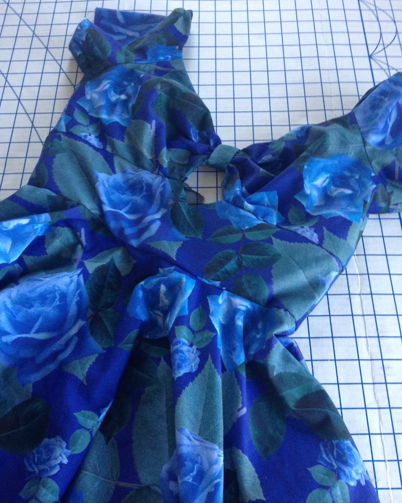
My original plan for this fabric was to attach a circle skirt to the bodice pieces of Butterick 6413.  


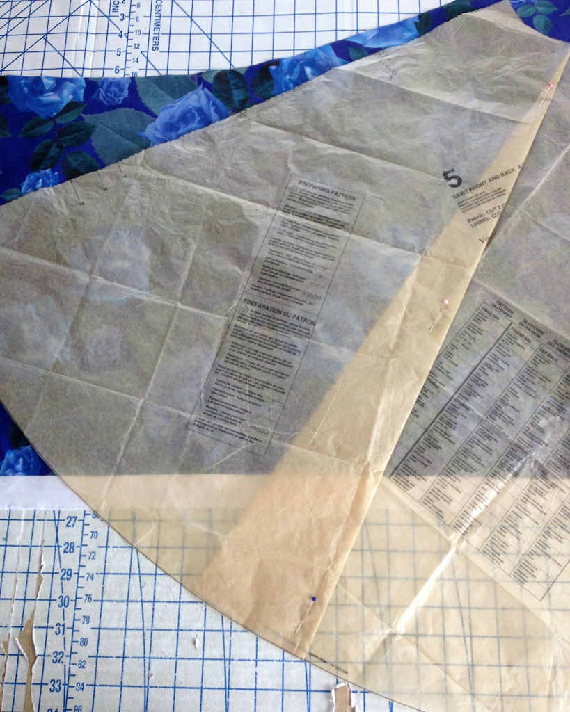
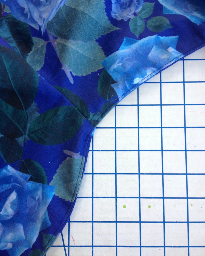
Unfortunately, I just could not make the circle skirt fit on my yardage without cutting one of the skirt pieces upside-down, which I really did not want to do.  This print is directional and I know I would regret cutting one of the skirt sections wrong side up.  I cut the back skirt pieces, taking a slight wedge out of the circle to narrow the piece.  This means that the center back is no longer cut on grain, but I would rather have that issue than have the print upside down!


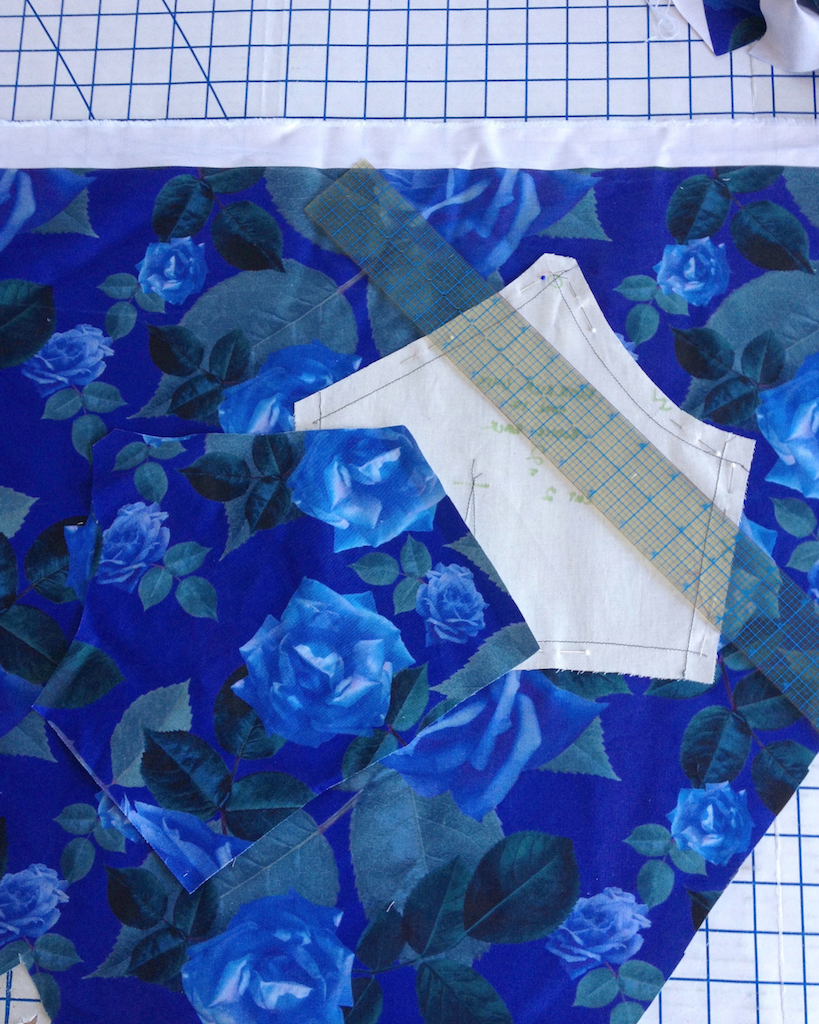
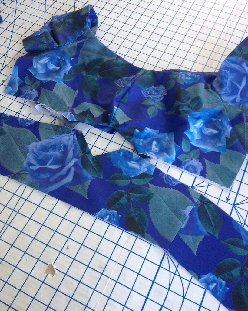
With the "scraps" leftover from cutting the skirt, I was easy to cut all of the bodice pieces.  I was even able to do a pretty good job matching the roses.


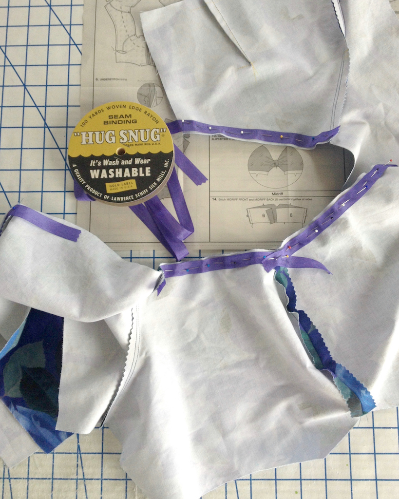
To stabilize the neckline I used rayon seam binding.


For the lining, I had just enough fabric to cut a duplicate bodice out of my fabric.  I did not have enough blue bemberg on hand, and there was really not enough of the rose print for another project, so I went with the roses.


I deviated from the given instructions slightly because I do not like to have both the fashion fabric and lining stitched together before inserting a zipper.  That application has always seemed sloppy to me - if I am using a lining, why not enclose everything?  And I certainly don't mind the hand sewing.


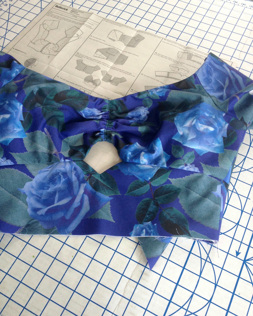
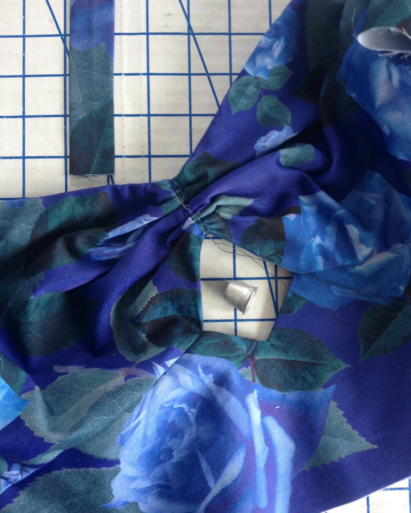
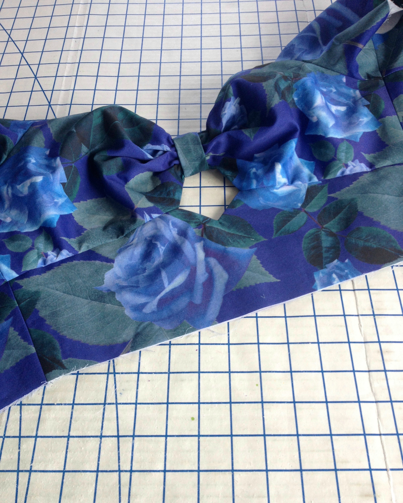
Perhaps I should have used a lighter weight fabric for the lining, because when it came time to gather the upper bodice, gathering everything down to two inches was challenging.


I attempted to bend the fabric to my will with the help of a zig-zag stitch.


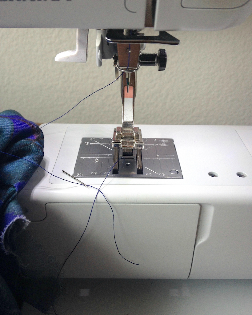
But my machine had other plans.  I can count on one hand the number of times a needle has broken on me, and each time it scares me half to death.  The sound my machine made was  horrible, which does not help.


Everything turned out okay for the dress and the machine, in the end.  I did have to use a thimble and a very thick needle to get everything gathered, but I won the battle.


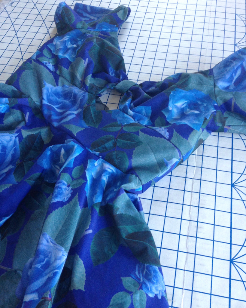
There is still a bunch of finishing work to be done, including the dreaded evening out of the skirt hem, but this is definitely beginning to look like a dress!


[Disclosure:  Contrado provided me with this fabric, but the opinions posted here are my own.]
Monday, February 20, 2017

Fabric Design with Contrado

I was recently contacted by Contrado with an offer to try out their fabric printing services.  Yes, please!


They offer a massive amount of textile choices (over 95) - maybe a little too many!  Navigating the fabric selections was challenging for me, and names like "Archway" and "Boston" are not especially helpful when trying to suss out the natural fibers from the synthetic - if I had to change anything about the experience, it would be that.  There are various filters to apply while perusing the online fabric selection, but none of them include fiber content.  Contrado was kind enough to send me a swatch pack to make the choice a bit easier.  The swatches also make it easy to see how fabric content affects the dye. 


And there are a few natural fibers to be found.  I was very tempted by the Lima Cashmere which is a wool/silk blend.  There is also a Viscose Twill, and even a Silk Satin.  In the end, I decided to go with Cotton Satin.  It is 100% cotton sateen with a nice mid-weight hand.


Then it was time to come up with a design.  And surprise, surprise, I went with roses.  This time around, I decided to learn just enough of Illustrator to create a repeating pattern.  For fabric design, I think it is definitely a better choice than Photoshop.  The fact that I can make something as large or small as I want is fabulous.  Hooray for vectors!  And because it is so difficult to find oversized florals at the fabric store, I went big!  


Once I was happy with the design, I uploaded it to the Contrado website.  It was easy to rotate the image so it follows the cross grain (I intend to make a circle skirt that will have to be cut crosswise).  And here is the actual fabric!  It arrived a mere four days after I completed my order, which is awesome. 


Before sending my yardage through the wash, I cut a bit off to see just how much the hand and/or color would change.  The fabric is still quite crisp after a bath.  There is perhaps a tiny bit of fading if I stare at it closely, but not as much as I expected with the darker colors, and certainly not noticeable if I do not have my original reference scrap.


And now it's time to cut this up and start sewing!


[Disclosure:  Contrado provided me with this fabric, but the opinions posted here are my own.]

Wednesday, February 15, 2017

Baubles & Beads

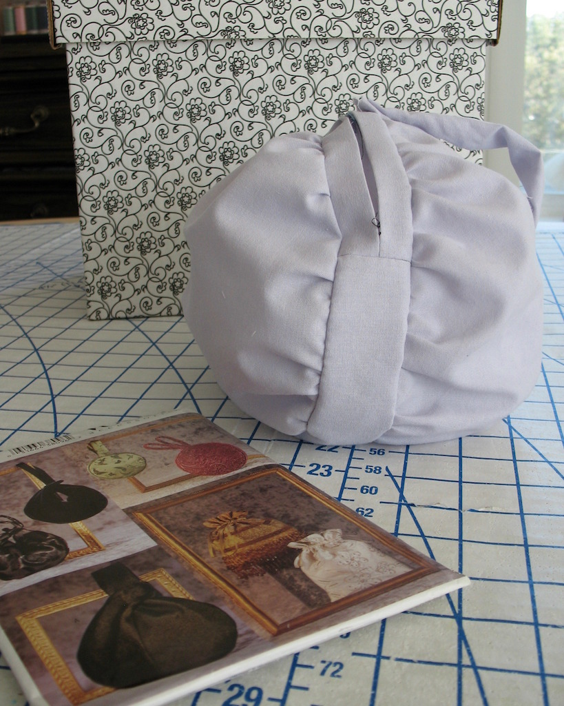
A few years ago, I made this dress.  I also made a matching velvet purse, but never got around to blogging about it.  Well, I am currently working with the scraps of the cherry silk/wool to make myself another dress, which reminded me of the bag.


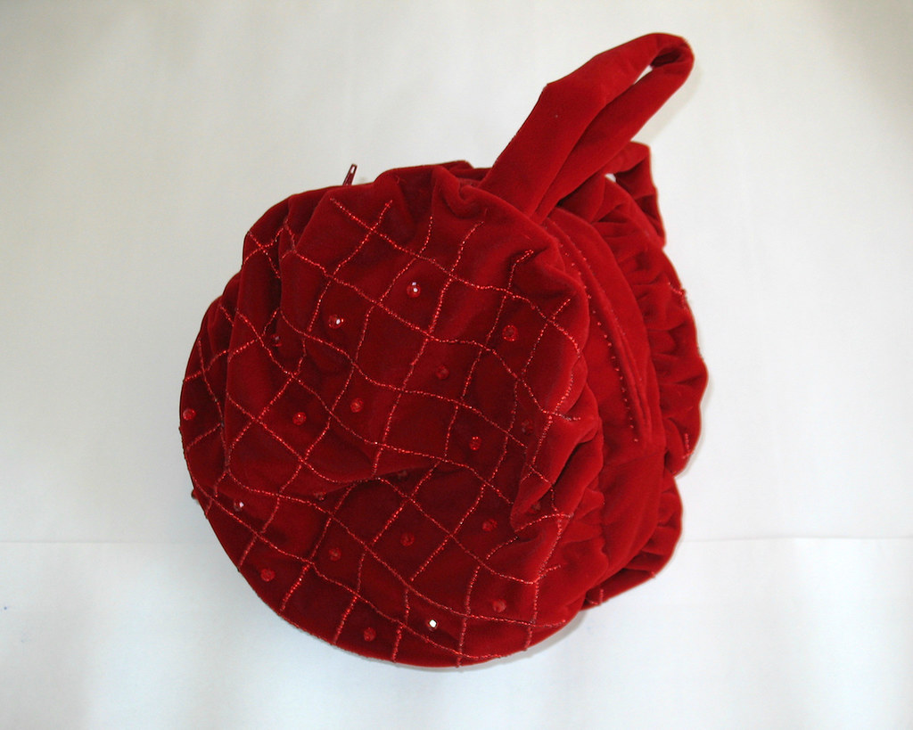
I had some red velvet stashed away, and it was the perfect fabric to make a matching evening bag for my cherry gown.  Coincidentally, I used the same velvet to make an oversized rose hair accessory  many years ago, and ended up wearing it with this dress.


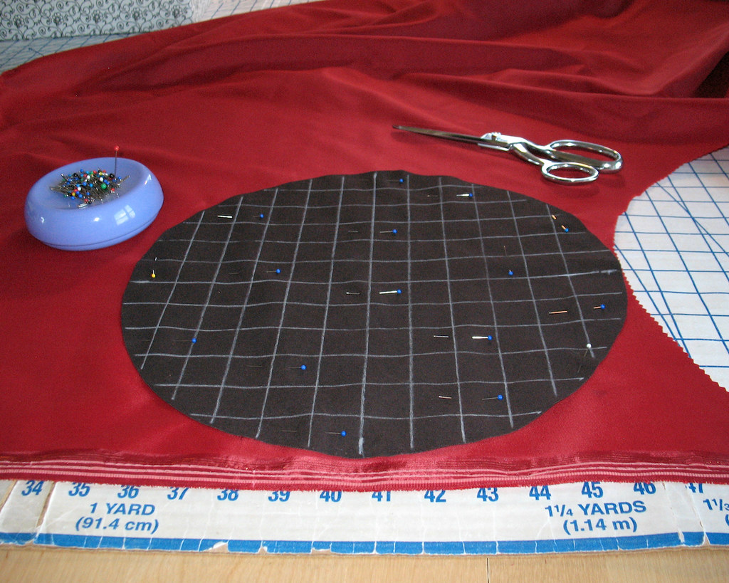
I started with Vogue 7354 as a pattern.  As drafted, there was hardly any room in the purse, and I wanted more of a round shaped accessory that might resemble a cherry, so I increased the diameter of the two circles that make up the bag.  Before cutting into velvet or spending a lot of time beading said velvet, I mocked up a version in some scrap fabric.  One circle was cut 1" larger in diameter than the original, the other 2" larger - I ended up using the larger of the two.


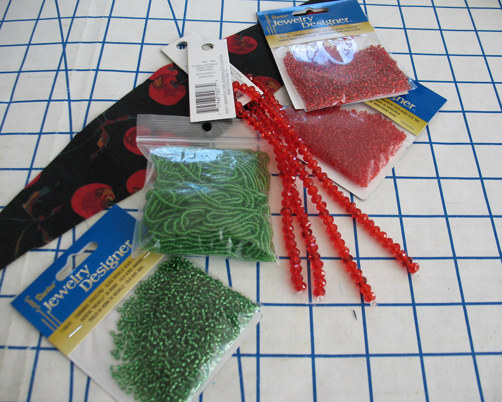
Some of the beads I found in my stash, but I did have to make a trip to JoAnn Fabrics to find the larger ones.  My initial idea was to really go for a cherry inspired look, so I thought I would add beaded leaves near the handles.  Unfortunately (or perhaps fortunately, as it turns out) time was against me, and the beaded leaves never materialized.


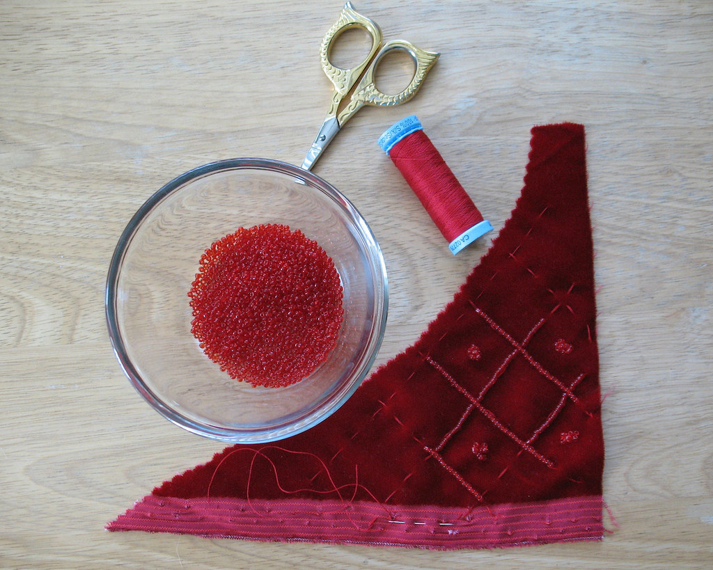
Then I had to test out my beading pattern.  If I hated it, I could scrap the beads and go for a plain velvet bag.  But where would the fun be in that?


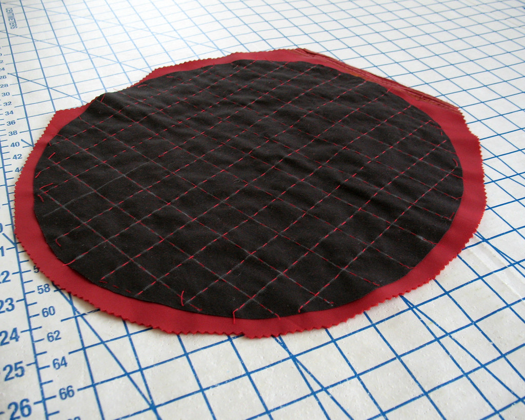
A scrap of cotton doubled as interfacing and a means to mark my beading pattern.


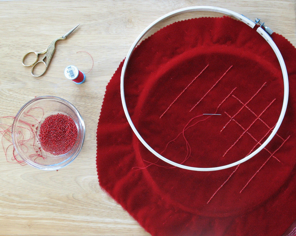
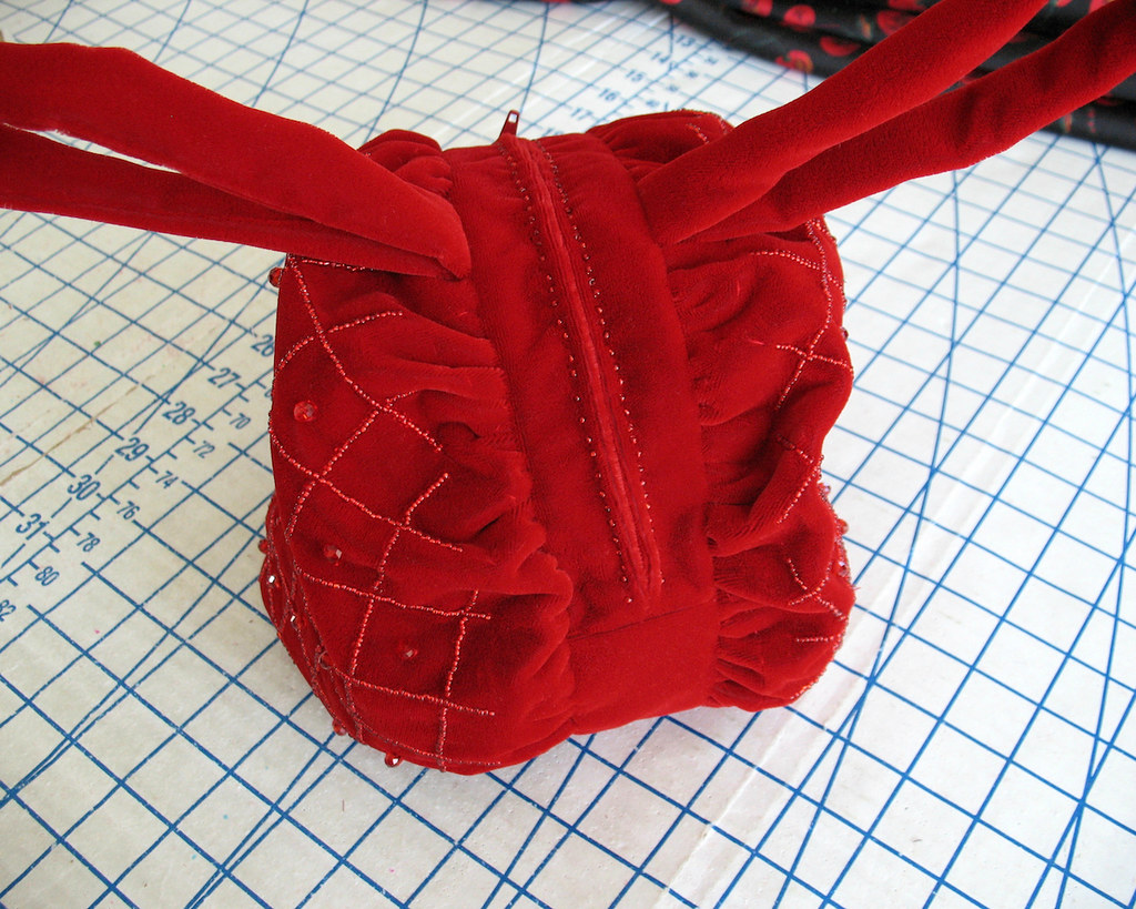
I basted the two layers together with red silk thread.  The thread almost disappeared into the nap of the velvet, but did leave a slight trail that I could follow while applying the beads.  And since the basting was invisible after the beading process, there was no need to remove those stitches.  Hooray!


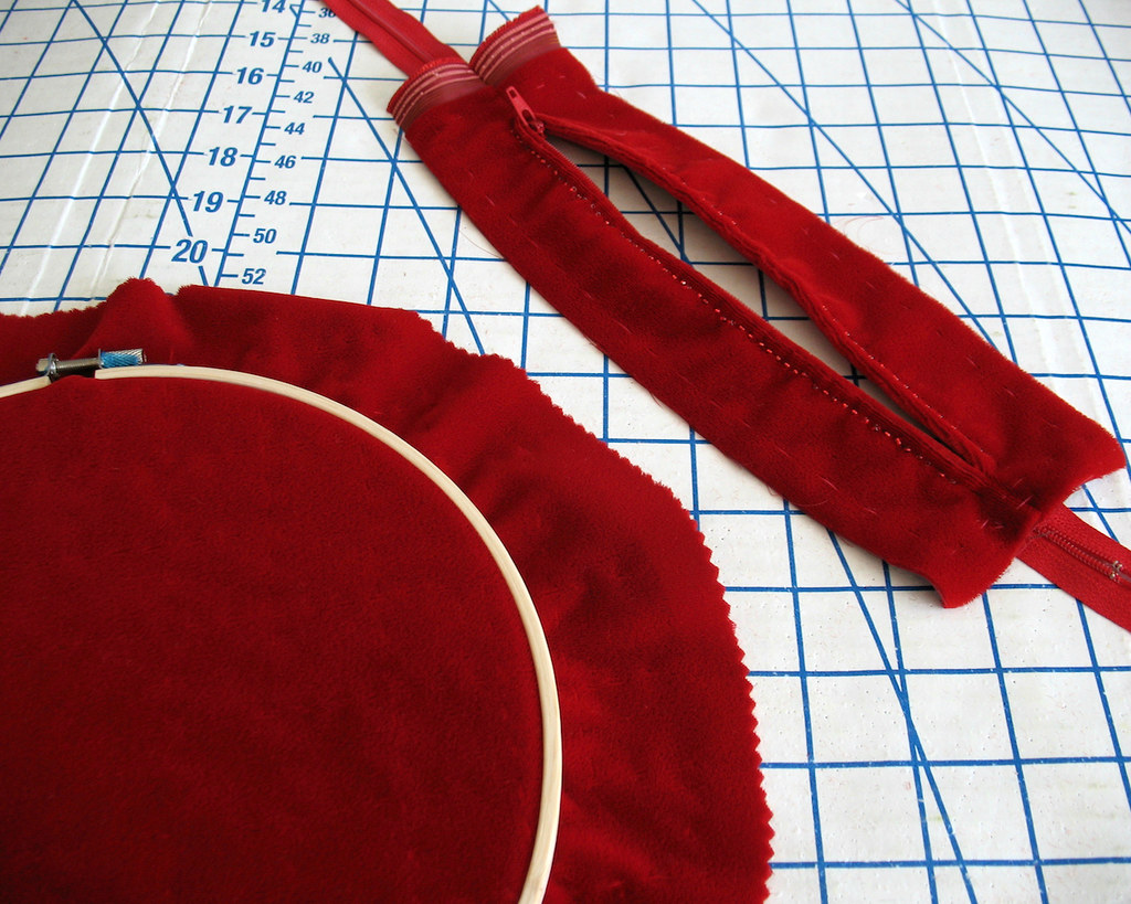
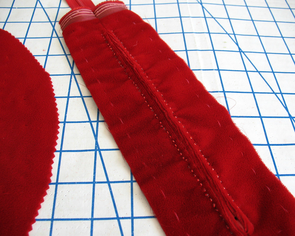
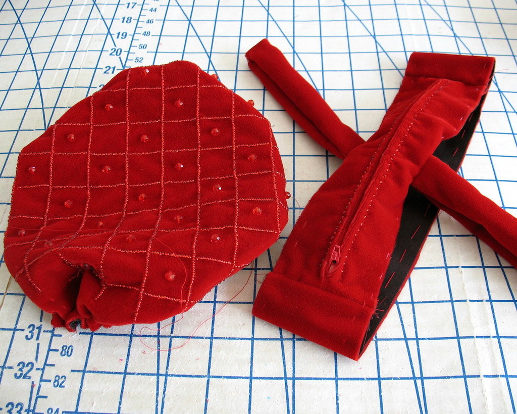
I was not about to fight with this velvet and a zipper foot and hope that the top stitching would look decent on the first go, so I knew I would be hand-picking the zipper.  


I decided to add beads along that stitching line.  A few years ago I saw this technique in Threads Magazine used on a center back zipper for a dress, and I thought it would work nicely for this bag.


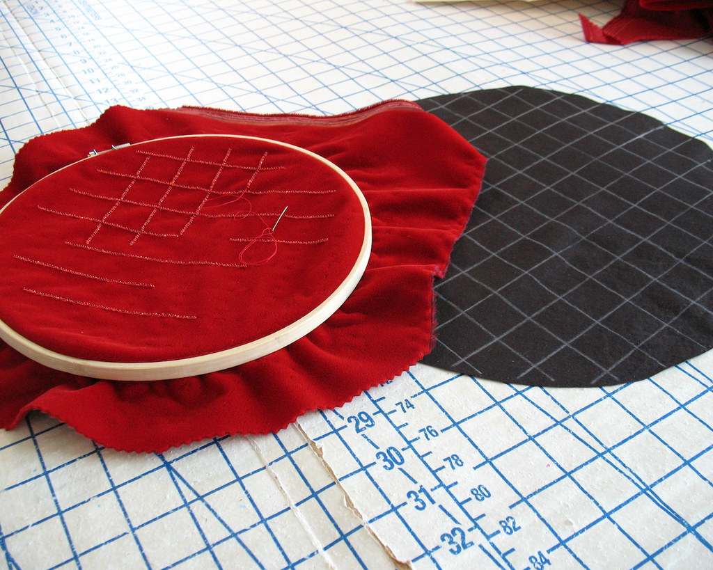
I was a bit concerned that the embroidery hoop might leave a mark in this napped fabric so I decided to make the beaded portion of the design fit within that hoop.  


As it turns out, the gathered velvet really masks where the beads stop, so there was no problem there.  And a quick blast of steam from the iron solved the ridged hoop issue.


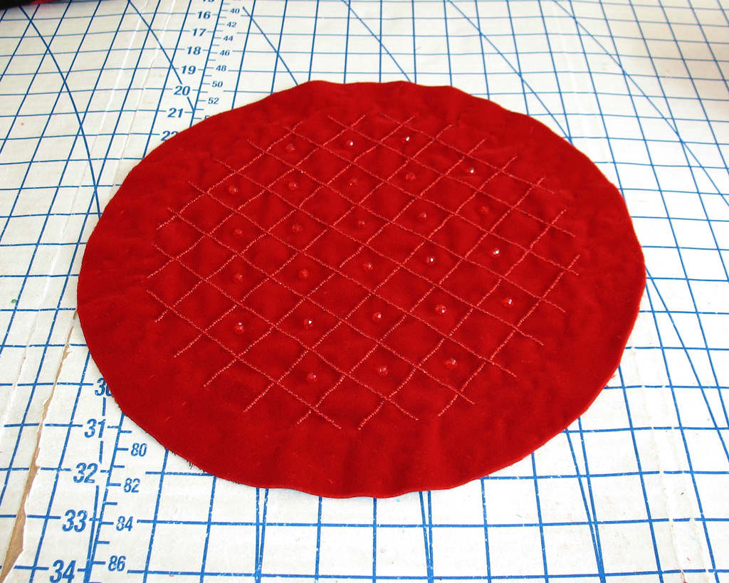
The final bit of beading was adding the large rondelles to the middle of the gridded pattern.  One side down, one to go!


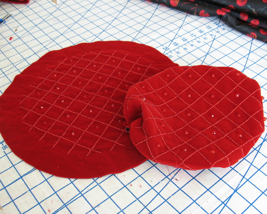
Once the beading was complete, it was time to stitch everything together.


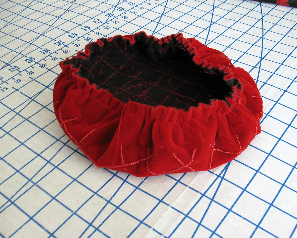
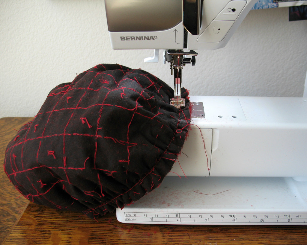
Gathering velvet fabric is a real pain, let me tell you!  But I did manage to get it done without breaking a thread, thank goodness.


The velvet pieces were basted together before sending them through the machine.  


Yes, I was in a rush, but I really did not want to rip any seams out, and without a walking foot, I just do not trust that my machine will behave.


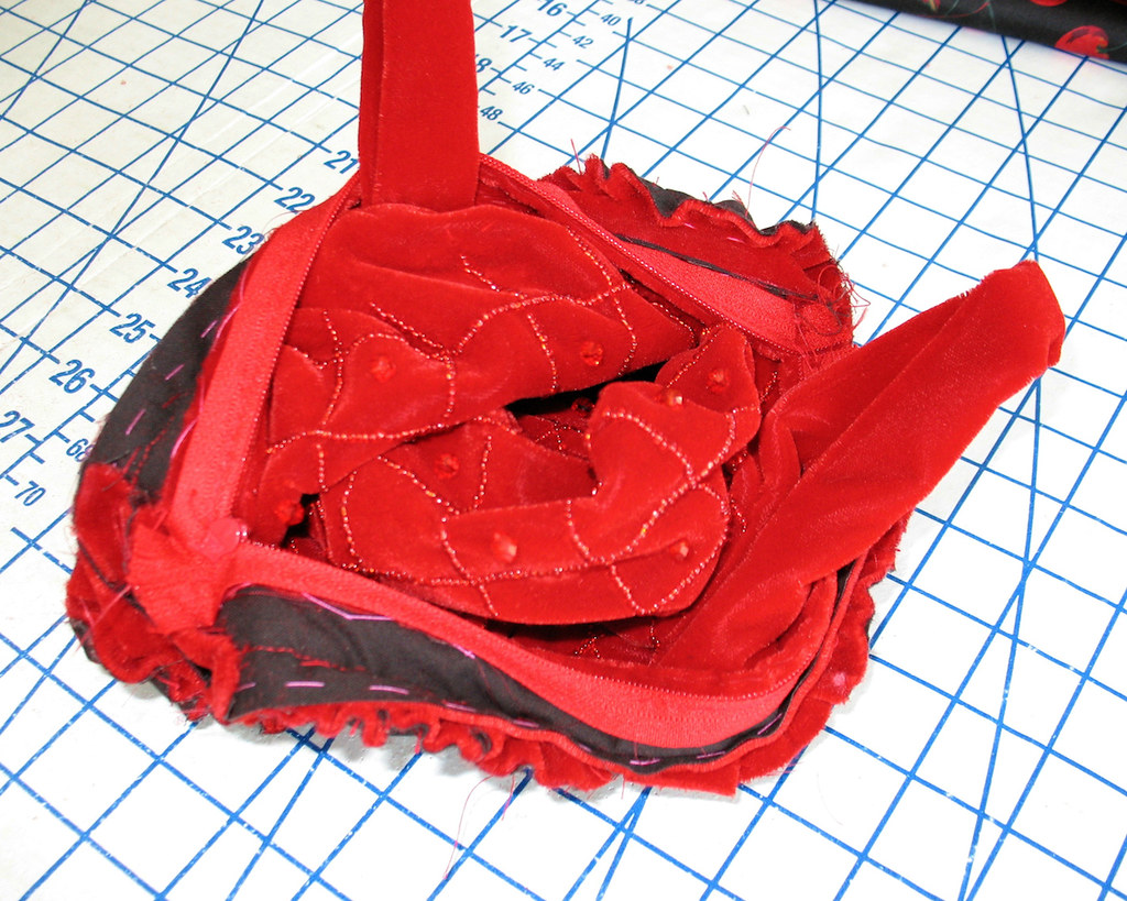
My basting served me well, and everything went together painlessly (although I can vividly recall thinking that this outfit was never going to be finished on time!).


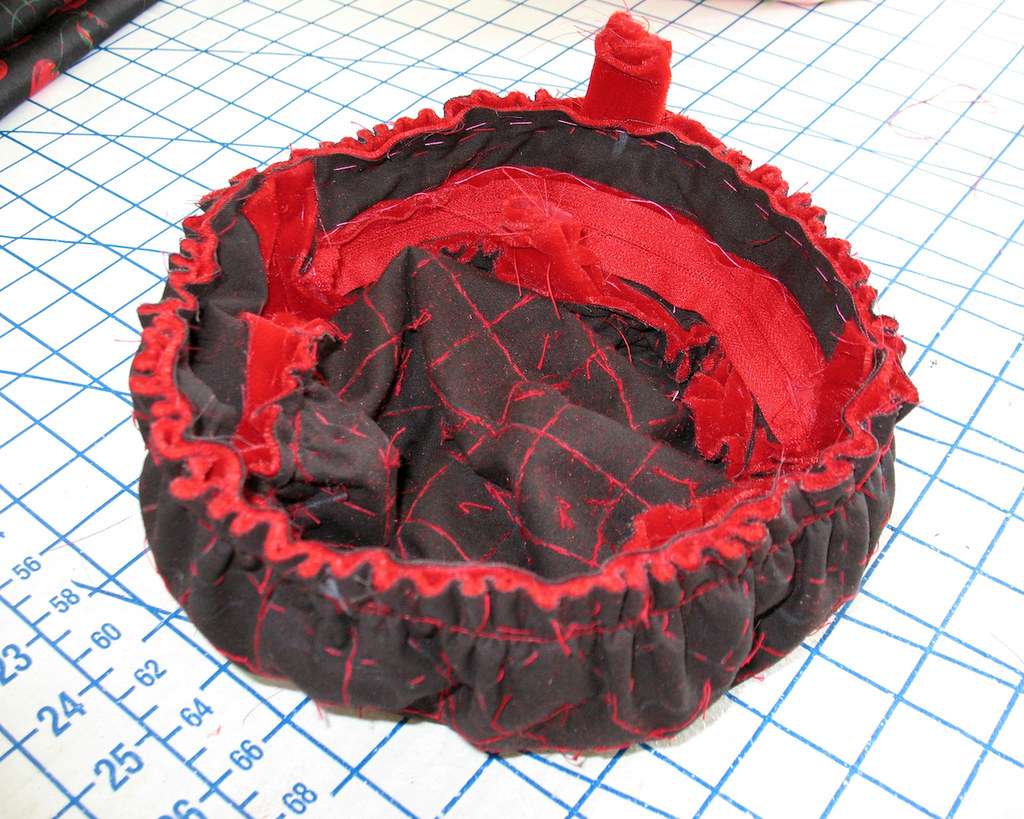
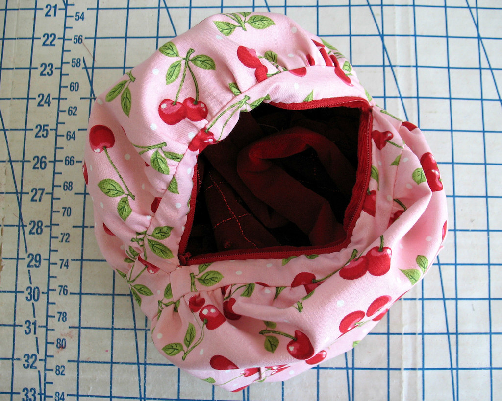
This lining fabric was not my first choice.  With no time to find something I liked better, I had to go with something that I had on hand.  


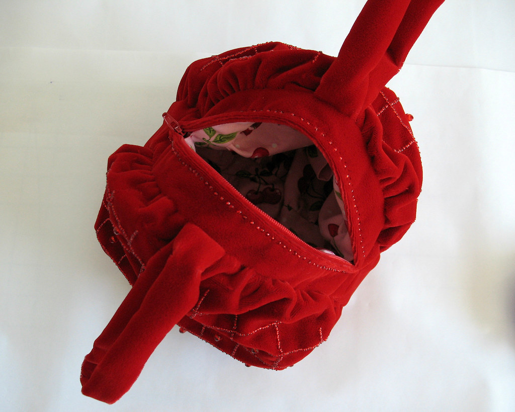
I prefer lighter colors in handbag linings because it makes it easier to find what you are looking for, and I thought the cherry print was a cute callback to the cherry print fabric of the dress.


And it doesn't get much easier than working with a quilting cotton!  That is one well behaved fabric.


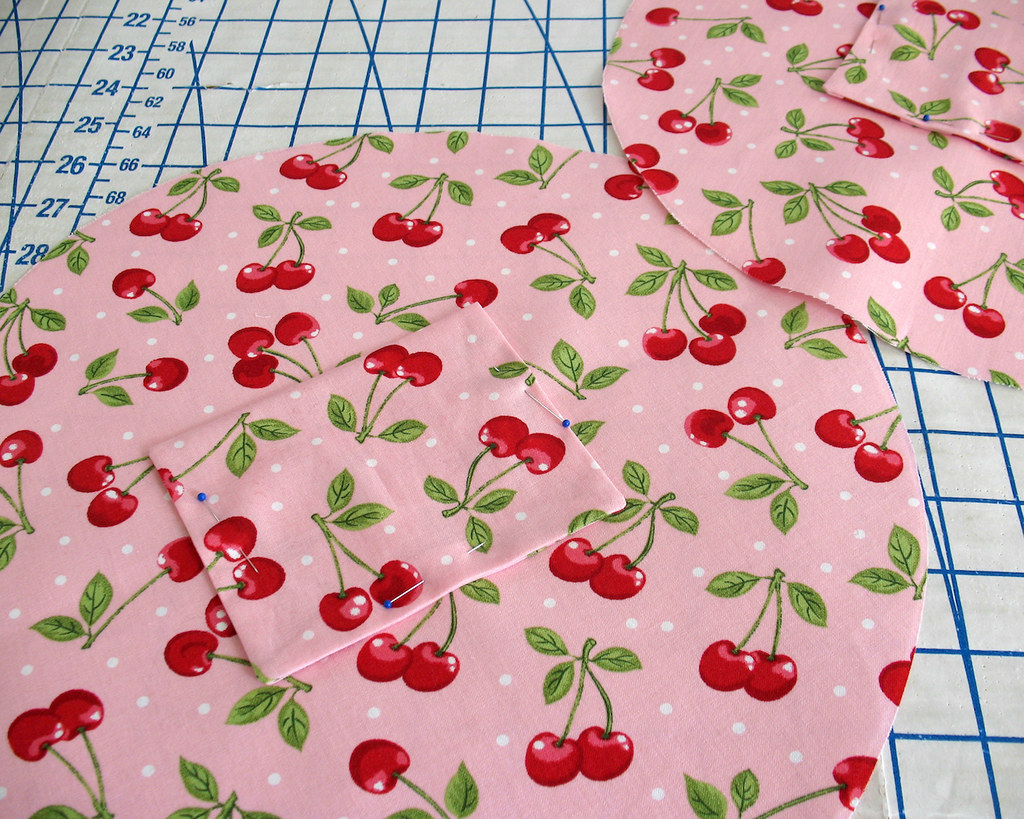
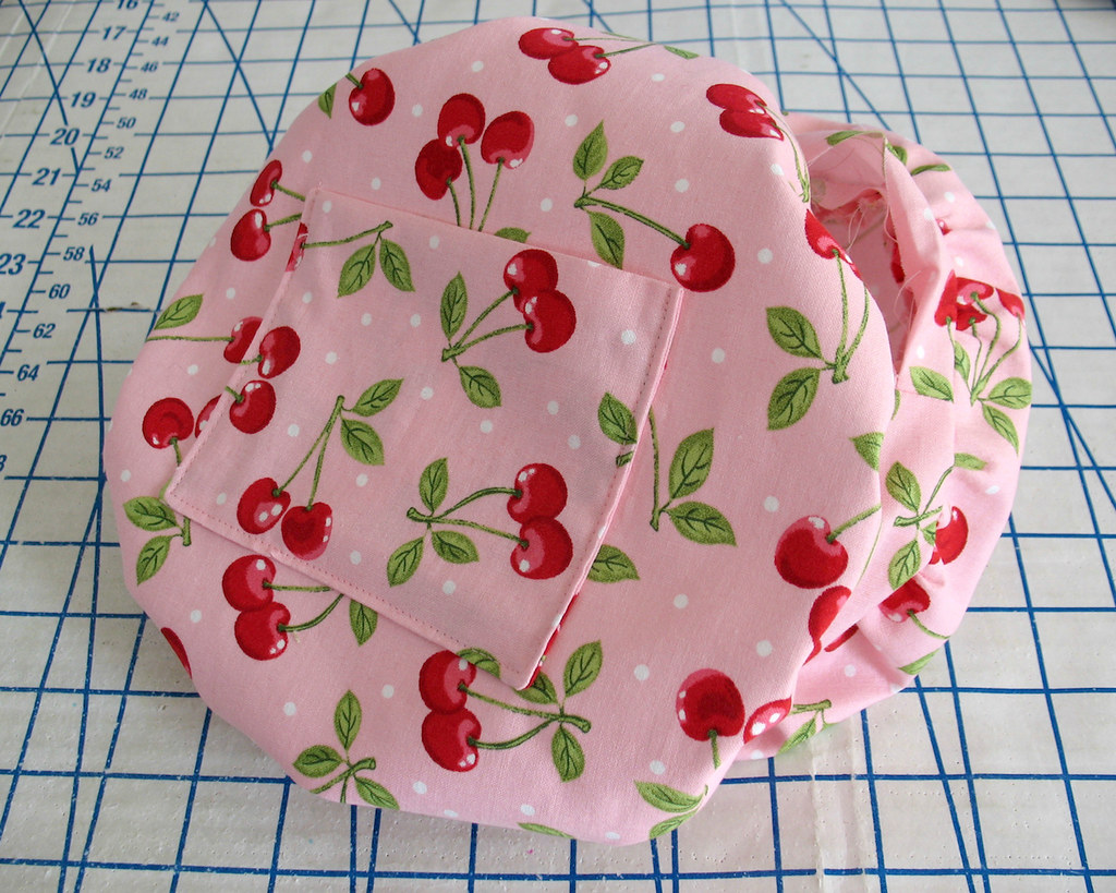
A pocket was added to each side of the lining. 


And there we have it.


Another accessory finished just in the nick of time.  And I think I like this one better without the green beaded leaves.  It is certainly more versatile this way.  


And I was pretty pleased that I did not have to use some old boring black clutch to complete my outfit!